The previous post was an attempt to rethink the brut in brutalism, not so much in terms of raw concrete but raw information. Still, a lot has changed in architecture since the 1970s, first with postmodernism and then with deconstructivism and subsequent forms of software-driven design such as blob buildings, procedurally-generated structures, cybernetic environments, and so on.
In The Interface Effect, I devote a few pages to Frank Gehry's Stata Center, the large university building that opened on the MIT campus in 2004. Following Gehry's signature style, the Stata Center features warped geometric forms cascading on top of each other. It "looks like a party of drunken robots got together to celebrate,” Gehry said of the building.
Yet not long after the ribbon cutting a number of design failures began to be noticed by those using the structure. The building began to leak and fail in various ways, so much so that the university sued Gehry in 2007 for alleged design and construction shortcomings. (Given more time we might elaborate the noble tradition throughout architectural history of signature buildings leaking or otherwise not living up to the minimum requirements of good design.)
Gehry was included in the “Deconstructivist Architecture” exhibition organized in 1988 by Philip Johnson and Mark Wigley at the Museum of Modern Art in New York. And he seems to have never shed the elemental spirit of deconstructivism, despite the expressionist nature of his work, a characteristic he shares with Zaha Hadid. Deconstructivism flourished in architecture during the 1990s and remains quite influential today, reaching its zenith, arguably, in Daniel Libeskind's Jewish Museum in Berlin, a marvel of a building whose original design was so radical it had to be toned down before construction, rectifying the verticality of the walls, among other changes.
I've long had an amateur's interest in architecture, trekking to visit Coop Himmelblau's outrageous rooftop remodel as a nineteen year old and today remaining fascinated by the work of the late Lebbeus Woods, by far the most interesting architect of his generation. Still, as time goes on I find myself more and more suspicious of deconstructivism, not simply in architecture but in philosophy too. I'm reminded of the merciless renunciation in Tiqqun's Introduction to Civil War:
“The only thought compatible with Empire -- when it is not sanctioned as its official thought -- is deconstruction. Those who celebrated it as 'weak thought' were right on target. Deconstruction is a discursive practice guided by one unique goal: to dissolve and disqualify all intensity, while never producing any itself.” (para. 57)
After first encountering this passage, it wasn't entirely clear to me what was motivating such a harsh dismissal. But it seems clearer now.
Gehry's signature style involves a certain amount of disharmony. He has repeatedly tried to break with the staid rectilinearity of the International Style. But, as the failures of the Stata Center demonstrate, even these broken styles are not allowed to break. Even if the building appears to fall apart, it cannot, in actual fact, fall apart. Like all good architecture, failures in function must be eliminated. Except, with deconstructivism, they are at the same time transmuted into expressionist design flourishes, the true breakage defanged and rearranged into style. Deconstructivist architecture is thus ultimately fraudulent in one fundamental sense. Walls may bend or warp, but they should not crack.
(This is another way to think about the the segregation effect describe in a previous post. The Stata Center shows the strict segregation between the semiotic or aesthetic level of the building, which features cracking and breaking, and the material or functional level of the building, in which breaking is, ideally, prohibited.)

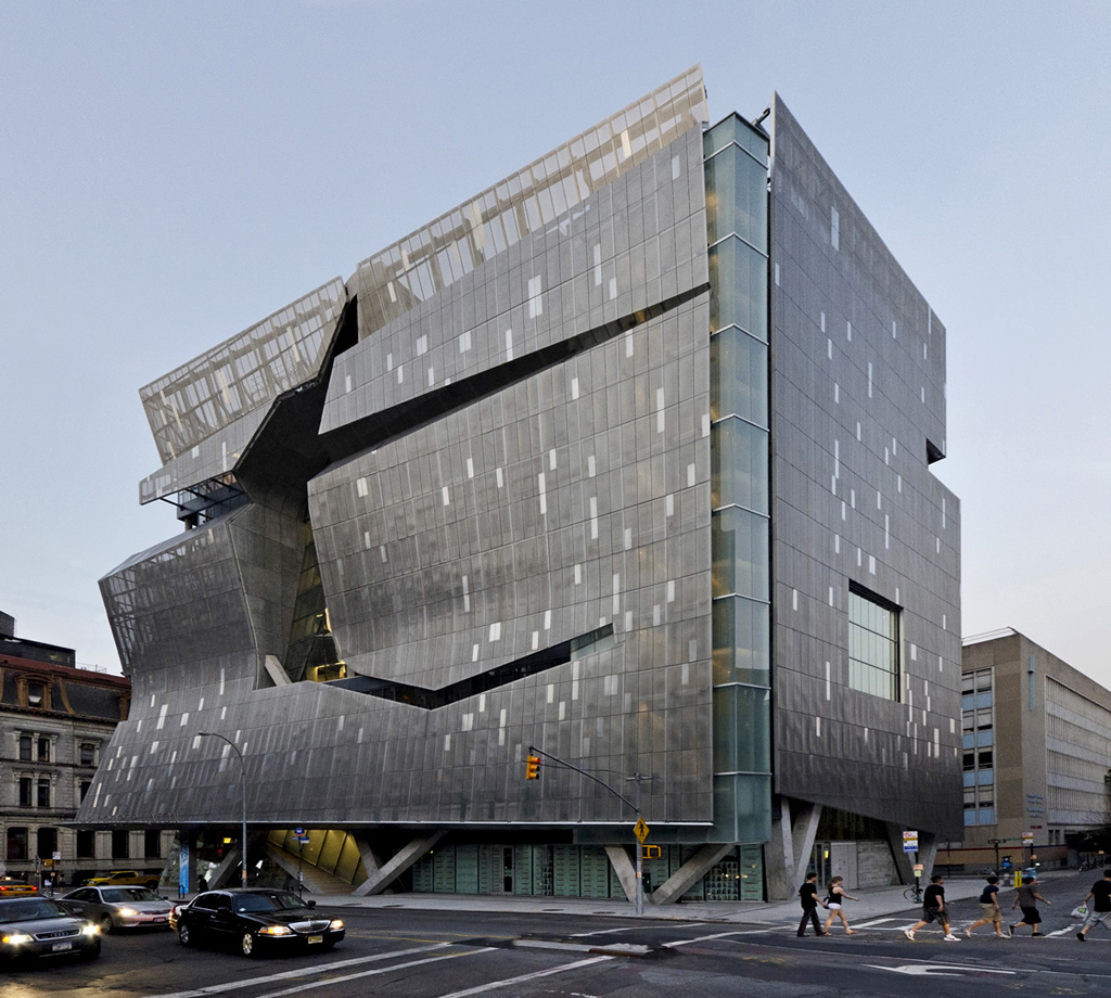
Now consider the new academic building at Cooper Union in New York. Designed by Thom Mayne of the Californian architectural firm Morphosis, the building opened in 2009, and has endured some controversy for the unfortunate role this expensive building played in Cooper's recent financial dealings, particularly the school's misguided decision to change its tuition policy.
Not a brutalist building, of course, the building nevertheless shares some qualities with the austere monoliths discussed in the previous post. It features rather raw and uninviting materials -- here a sheer metallic exoskeleton rather than the traditional unfinished concrete of the béton brut -- to present a weighty, imposing face to the street. The same large chunky slabs are also present here, only slashed and carved up into irregular blocks. And, instead of windows, the skin acts as a kind of semi-permeable membrane, allowing and excluding visibility.
How persistent is deconstructivism. Is there no architecture today that is not geometrically disassembled into an amalgam of trapezoids and parallelograms (as with Rem Koolhaas), or the result of turbulent flows through space (Zaha Hadid), or bounced around like Jell-O (Frank Gehry)? It appears that the Santa Fe Institute has taken up where the International Style left off. Today form follows information. Emergence, chaos, flexibility, complexity, artificial life, bio mimicry, ecological dynamics -- these are the new International Style.
Deconstructivism twists the logic of the black box one degree further. Architects no longer design black boxes. The design process itself has become the black box. This is why the Cooper building is damaged, why it features a huge gash across much of its exterior, why it can't stand upright. The paradox of the black box reappears as pure form. Not simply located in the membrane between inside and outside, the logic of the black box is now a part of the very structure of the building.
Architecture was an early adopter of the personal computer. Still, there's a chicken-and-egg problem with deconstructivism and computation: if the first generation of deconstructivists were still draftsmen reading Derrida, the second generation is more likely to be a coder reading Deleuze (and, incidentally, more likely to decline the deconstructivist label as passé). The personal computer and information sciences have both helped define deconstructivism and also morphed it into something slightly different than what it once was. Specifically, consider the revolution in architectural drafting that took place with the adoption of computer-aided design and three-dimensional modeling software. A definite aesthetic sensibility flows through these software tools, often legibly reappearing in the final product, so much so that we can say that the informatic quality of the software is now embedded directly into the facades and structures of buildings.
The undulating skin of the Cooper Union building admits to the process of its own fabrication via modeling software. The tools make such undulations rather trivial, whereas they would be difficult if calculated and drawn by hand. The interior of the building is even more explicitly “of” the information age, with a profusion of wireframe structures, the same wireframes formed by connecting vertex matrices in three-dimensional modeling software. The technicity of the building is not so much that it houses technology (it doesn't) but that the the architectural style is an informatic style. This is what makes it a black box. The Cooper Union building has a black-box relationship, but to itself not the street.

The AT&T building houses an information system and mimetically duplicates the structure of the black box, but the Cooper Union building is the secretion of an information system and thus pushes the logic of the black box even further. The AT&T building displays what one would call a “formal subsumption” of information systems, yet the Cooper building is a “real subsumption” of them.
The interface between aesthetics and functionality is key. Such is the basic question of the black box. Does a building hide its function and hide its interface, following the phone switch buildings? Or does a building, following Piano and Rogers' Pompidou Center, use function as aesthetic materials? There are a number of different possible approaches. And if the basic encounter in the 1970s was between inside and outside, the basic encounter today is entirely contained within the design itself. Aesthetics and functionality are distributed and organized into particular roles. Yet the principles of the black box exist within the design process itself (evident indirectly in the final product).
Such is the great paradox of deconstructivist architecture: it must divorce function from aesthetics; it must stand up, all the while feigning imminent collapse. It must be knowable and unknowable at the same time. It must synthesize in metal, glass, and wood what it means for materials to be obfuscated from themselves. It must tear itself apart, partitioning subsystems and facilitating distributed flows of bodies and bits, only to reassemble itself again. It is this very reassembly that returns as style. The gash in the Cooper building is thus a figuration of the paradox of the black box, a figuration of the incompatibilities that clash together within digital systems, and that must ultimately be standardized in the end under the banner of total integration.
If the modern period taught us to revel in the erasure of the self, in the perversity of our own annihilation, the postmodern and contemporary periods have taught us to revel in the unbridled expression of things but only in damaged form. We are free to build whatever we wish, only, please, limit yourself to the vocabulary of the control society: fractured blobs and broken nets.
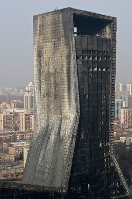
In the end, I suspect the most emblematic architectural event of our times will be found in something else altogether. Perhaps we will find it in Rem Koolhaas' Mandarin Oriental hotel in Beijing, which burned to a crisp in 2009 after stray fireworks set off a raging inferno.
Unlike the Gehry building described at the outset, here is a black box that is honest about being a black box, because it announces itself as such. Not Gehry's deceptive aesthetic of undamaged materials in a damaged form, here we see a new truth in architecture: damaged materials sitting atop a damaged form.
